Core Mechanic, d20 roll under Target, or critical on exactly the target. 20 is a fumble, target cannot exceed 19.
Armor is ascending, but starts at 0 for unarmored, 2 for leather, 4 for chain, etc. To hit a foe you must succeed at the attack test and roll above their armor. The math works out to about the same as standard ascending AC, but has less mandatory math with every attack roll. Shields and staves can be shattered to negate a hit.
Classes: Each class has 8 unique talents that are not just numerical bonuses, but open new possibilities. For example, the Cleric has a “Confessor” talent that allows them to see lies as blood-red smoke, the thief has a “Disguise” talent that allows them to craft a perfect disguise with 10 minutes work that can be thrown off as an action, Mages can gain a familiar as a talent, and Fighters have a variety of combat and non-combat abilities that allow for more utility.
Magic is ripped right out of the GLoG. Magic Dice are awesome.
Layout is designed to be very easy to reference and understand at the table.
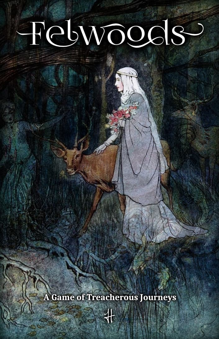
Art is all by Warwick Goble, and currently in the Public Domain.
Referee Support is included in a handful of pages. It covers adventure design, monsters, and some treasure. I’ve been told it’s good, but would especially like to know if you find it useful.
Compatibility is a big focus. It should work just about out-of-the-box with most OSR adventures.
I’m hoping to do a big Kickstarter with this to raise funds for my college classes, but I don’t have a lot of time to devote to a huge kickstarter due to college classes. Not sure how to make those two ideas work together. It doesn’t seem like a “fire and forget” type of project.
My first impression on a skim is that I love the art and layout. You’re also using my favorite resolution mechanic (I’ve heard it called blackjack resolution before, and that’s what I like to call it), so I definitely dig that. The ref advice looks solid. Your talk of scenes reminds me of something like Trophy Gold—not sure if that was intentional or not, but I always enjoy just a splash of story game in my OSR (but just a splash!).
Again, I just skimmed it, but I definitely feel like I could pick this up, grab any ol’ OSR adventure, and just run with it—so mission accomplished there.
Let me know if you want any specific feedback on anything specific and I’d be happy to give it a closer read.
Looks good! Definitely interesting to get a bit deeper into this, but here’s some quick-fire things I’ve noticed:
Layout: The headlines need more distance to the following paragraph, texts after bullets less (Affinity’s default is weird). I also dislike centered text in tables, but that’s more a personal pet peeve.
Layout II: I wouldn’t mind a bit more hierarchy and “points of interest” sometimes. Boxes, icons, maybe color, use of white-space. Especially the class sheets could benefit from this.
Art: Love the focus on a single artist, gives it a bit of a mood. Reminds me a bit of Lucas Rolim’s Pacts & Blades
Speaking of mood, maybe the text could pick up a bit more of this. The equipment comes very late and that there are no sample monsters. Even with compatibility at mind, it might not hurt to have a more personal spin for the default.
Combat is a bit dominated by the wounds and morale.
Downtime is the only place where factions are mentioned, and then it’s not quite clear what they’re for or what they could be. And spending treasure seems mostly to be about not adventuring…
I think a bit more “connective tissue” would be nice. Right now it’s “here’s the player stuff, here’s the GM stuff”, maybe an introductory section could help here. Cairn has its manifesto, other games are more about exposition and mood here.
Most of my layout is self-taught. I just saw the post on layout in another thread. Maybe I should go forth and glean.
Specifically, I don’t really know how to make boxes and sidebars flow smoothly.
Icons could be a cool idea, especially for the class core/resource/capstone breakdown.
In trying to keep pagecount low, I can see how I’ve skimped a bit on flavor. I have a paired zine I’m still poking at, albeit very slowly with college classes these days, that will be very setting-based.
I could probably get another sheet into this to flesh out the setting and vibe.
I wonder if it would be fitting to just include the setting and a starter 1-page adventure as part of this zine, or if that would get too bulky in page count.
Thanks! Good to know the first impression lands well.
If there’s a single area I’d most like feedback on, it’s probably the class talents. They’re intended to be moderately useful tools, but “balancing” them so that none are obvious picks or disappointing rolls is a tricky task. I think they’re alright at the moment, but the more eyes on them the better.
I’m deep into prep for an adventure, but had a quick look at the Warrior’s talents. I don’t quite understand the way some of them work, though. If no test is mentioned, do they always succeed? That would make the “Challenge” a bit too weird for my tastes…
Is it really impossible to “track” with just a regular Test?
The intention with most talents is not to make what should be possible for others purely the domain of those with the particular talent, but to make it much easier, or to make a typically impossible thing possible. If that’s not coming across, I have editing to do. (I’m sure I do!)
Here’s the updated version, also: boxes and symbols!
I like the new class formatting, but I’m obviously a bit biased now
Not so sure about the specific box shape/color outside of this, though. Might look a bit too much like a sidebar. Maybe something brighter, like a more saturated version of the package background?
As for the talents, I think I like those of the thief and mage the best. There are enough of them that have non-combat uses and they reinforce an obvious stereotype. The cleric is where I see the most problems. Confessor and Spirit Walker seem way overpowered, basically allowing you to circumvent whole adventures with ease.
When I read the class section, my personal impression was that the fighter would be a great approximation for the more “myth”-y side of things, your Beowulfs, Siegfrieds or Herculeses ready to do their deeds labours, whereas the thief was both the rascally delver of the D&D side, and a bit of the folk hero/fairy tale trickster (“Bird Speech” as the first talent is chef’s kiss in this regard). Not quite sure about the cleric and its inspiration, but that has ever been the problem since 1974…