I’d see examples of beautiful charts and graphs posted.
Is it the font, the size, the density, the alternating line fill opacity? Are they nested? Legible and crisp? Hand-drawn and evocative?
I just know that, maybe beyond maps, they’re integral to my interplay with a module because they provide the initial spark of myriad possibilities that I then pass on to my players.
They are the game I play before the game itself.
3 Likes
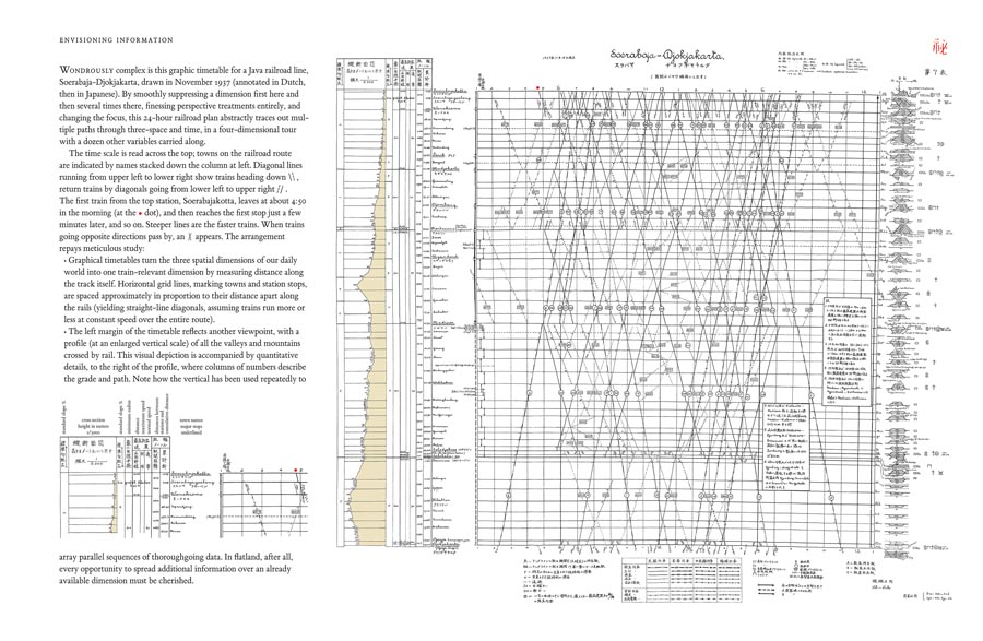
I have a book called ‘Envisioning Information’ by Edward R. Tufte that has some really interesting examples of ways to visualize data. You weren’t really asking about maps I guess, but maps are a kind of data visualization too.
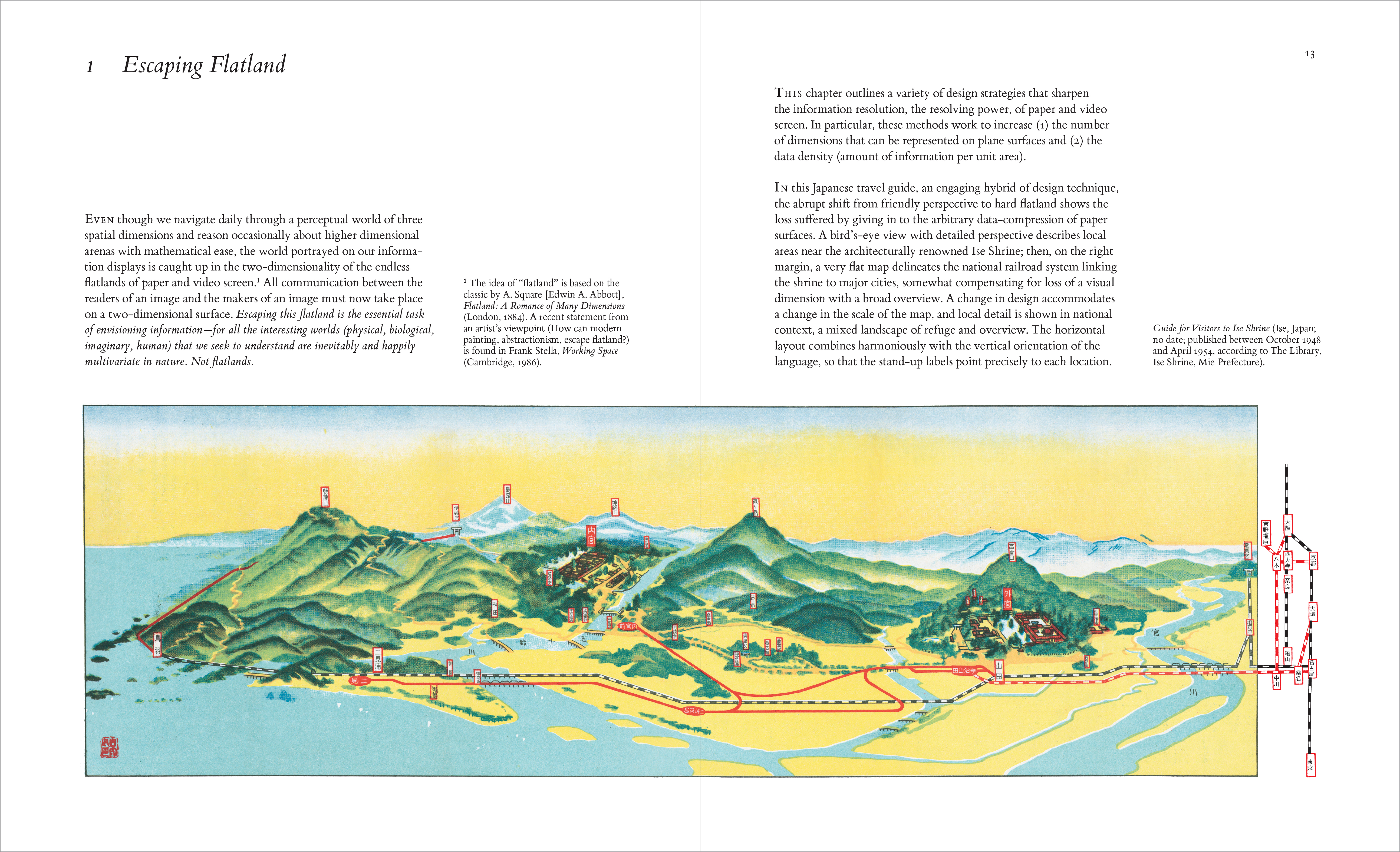

This one is a chart of train schedules (posted two versions, one more zoomed in)

1 Like
Nope: you’re on point, Jam D—Tufte is my high-water mark. I have all of his books. Thanks for posting these. Absolute visual deliciousness.
(Plus his page layout is solid too, and something I’m hoping to import into RPG book-craft to start drawing fresh outside-the-genre water into the pool)