I believe the OSR and NSR spaces are doing a lot of innovation in adventure layout, even if some of that might be more mimicry than understanding what goes into that (I’ve been guilty of this myself).
Whereas it sometimes seems to me that in the more mainstream spaces, one of the last bigger innovations was the boxed text. And that’s only slightly hyperbolic. (One of the few exceptions would be the sidenotes used in Underground and contemporary Monte Cook products)
Note that I’m mostly talking about functional features. The Dracula Dossier re-printing the whole of Stoker’s Dracula novel with annotations is an awesome idea, but the formatting and layout are rather specific to it and not “just” aimed at making navigating an adventure easier and more effective.
Layout has become something I’m looking at closely, currently. I’m working on some adventure modules that I want to make as easily usable as possible at the table. I’m picking up products that people tout for usability and seeing what others are doing. I’m paying attention to discussions where atypical folks tell about issues they’ve had with formatting. The difficult part will be getting material laid out in an obstensibly final form and then trying to look at it for use as if I don’t know the material.
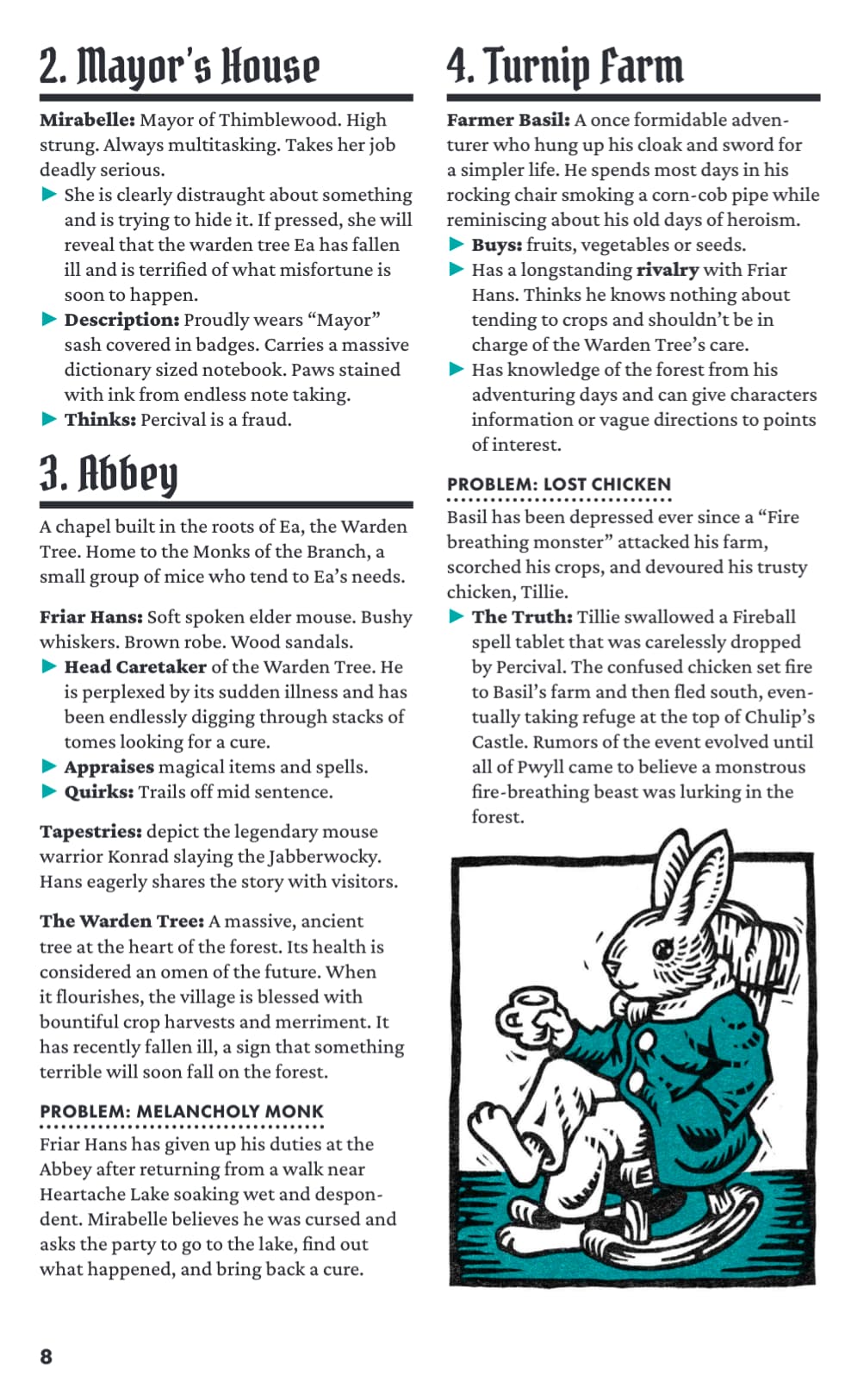
I guess that’s where finding blind playtest groups comes in.
I am absolutely lovingthe layout on Tiny Tails, the zine for Mausritter by Josiah Moore. It’s an amazing combination of great text, great art, and great layout (Josiah is amazing at all three).
The text always flows down. There’s no jumping between columns. Sections are clearly defined. The art is relevant and unintrusive.
It’s easy to read and easy to parse at the table. Simple and with space for improvisation, but still more than enough to be able to play it without much prep work.
The only thing I dislike about this zine is that the general hexmap is on page 12 and not in the inside of the cover.
Yeah, that’s pretty much my point of comparison. There’s plenty of OSR/NSR layout done that way, whereas mainstream D&D-ish is still stuck with the same read-aloud-box + gray text content (what we in Germany call a “lead wasteland”).
Mostly looking for the mainstream part in this thread though, good *SR layout probably deserves another thread (or probably already has a few of those)
To be honest I don’t even blame D&D adventures. People want hardcover books and writers are paid by words. The incentives for long, boring prose are there. And D&D players seem to be content with the restrictions of a long campaign where there’s a clear path to follow, so again, there’s no incentive to change.
The OSR style of bullet points, bolding and such is much clearer for me, but I guess that’s personal preference
It’s funny. I prefer the spartan monster descriptions of ShadowDark when running a game but want the lore imbued text of LevelUp 5e Monsters Menagerie (which I enjoy) when I need to learn more about the creatures.
In some ways the mainstream texts are written for reading pleasure, as in get cozy with the book and explore. OSR text is very utilitarian made for creating and running.
I’m thinking that’s what a bestiary is for. The Monster Manual holds the details and the adventure just the basics. Unless the author puts full descriptions in an appendix–that works, too.
True enough. I’ve liked some setting guides for the same reason. Tried running Fortune’s Wheel for Planescape 5E though, and did not like it. In part because the adventure was way too wordy and partially because it was 5E. There’s too much unnecessary verbiage.
It put me off 5E so bad that I haven’t looked back.
OSR also often expects that you already know a lot of the game’s background and traditions, i.e. most texts aren’t really introductory. And it seems like they’re also going for a wide range of different interpretations, so it’s more difficult to present a “canon” extended background, I’d say. This then integrates well with the more sparse style, the penchant for (IMHO way too much) horror trappings and the limited time OSR people tend to have (for all but the most crowdfunded projects).
Having said that, I would actually say that for monsters you’d probably find a lot more interesting mainstream attempts over time than for e.g. adventure presentations. Many attempts of delivering stat blocks, the 3E Iron Kingdoms “Monsternomicon” that did very well with a more in-world attempt, as did the HackMaster 5E Hacklopedia. And of course the AD&D 2E attempt of providing everything in a ring binder.
The struggle is in trying to balance at-table usability, beauty, and depth. I’ve noticed a lot of designers tend to pick one of those, and they can be cool products, but the ones I want to keep bringing to the table usually have all 3. I know Brandonsford gets talked about a lot, but it genuinely strikes this balance fairly well.
It’s handy as a designer to have a firm expectation of how you expect a book to be used, and then clearly communicate that up front. What does the Referee need to read/memorize, what do players need to know, what sections are prep-tools vs. at-table reference, etc.
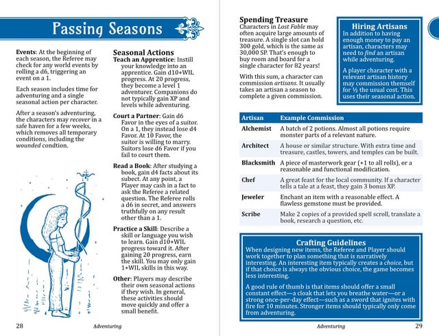
My current project has 3 color-coded sections for character options, adventuring, and adventure-building. Key rules are placed in colored boxes to catch the eye. The art is a bit sparse at the moment.
I agree completely. People love Mork Borg for its amazing design but it’s so radical is quite unusable at the table. I will 100% prefer a balance between design principles.